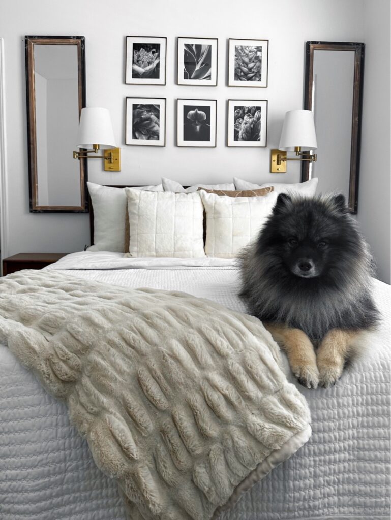
No sooner than finishing my master suite refresh do I decide to sell my place. For those that have followed along, I haven’t even made a year at my current condo. I know, I know…my bed’s not even warm yet! So why have I decided to move on from this place? Hint: a picture’s worth a thousand words, lol.
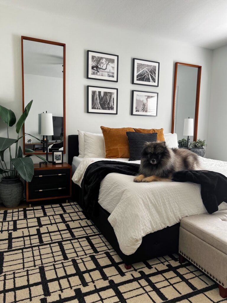
If you guessed my fluffy pup, you’re right. If you’re new here, meet my fur baby Kez. A 4 year old Keeshond I adopted from England (crazy, right?!) AFTER I bought my current condo. Long story short, this place lacks ample outdoor space I would like to have for him to run, play and bask in the sun with me while I work from home. So although I have been loving making this place my own for the last several months, I’m excited for my next space, this time with a yard and patio!
While this place is still home until my next move, I thought I’d share the final look of my master bed and bath. I have tried to keep the spaces throughout my condo cohesive by sticking with a similar color palette and design style. I love the contrast of black and lighter neutrals, so you’ll see plenty of that throughout. Alone, these colors can read sterile and unwelcoming, but I warm up the space with natural wood tones and greenery.
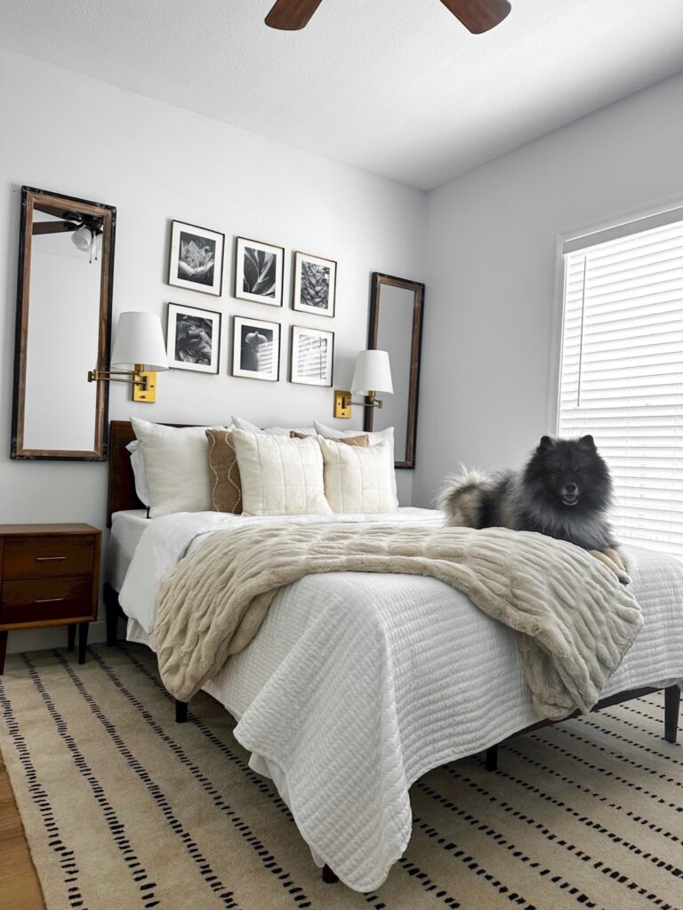
Keeping the walls in my bedroom white make the space feel bright and airy. I need sunshine in my life, so I love that there’s plenty of natural light that floods the room. I centered my bed on the largest wall, and anchored it with matching bedside tables. To give the illusion of higher ceilings I opted for long, narrow mirrors to draw the eyes up. The mirrors also acts as additional “faux windows” that help bounce that natural light throughout the room, making the space feel even bigger.
Because the majority of my decor are solid colors, I made sure to add interest by using varying textures. Examples of how I achieved this are the suede and faux fur accents on my bedding, faux plants, etc. If you noticed, although similar, I featured two final looks. I love them both, but decided to swap out the brass wall sconces. Instead, I went with rod iron table lamps that fit the space better. This one small change started a chain reaction that prompted me to swap out the mirrors, side tables and area rug, lol. It’s all good, because home decor is a process, and ultimately I ended with exactly what I was looking for!
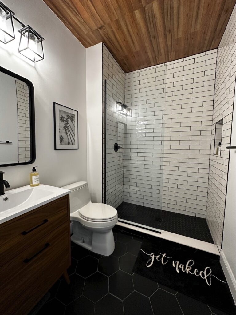
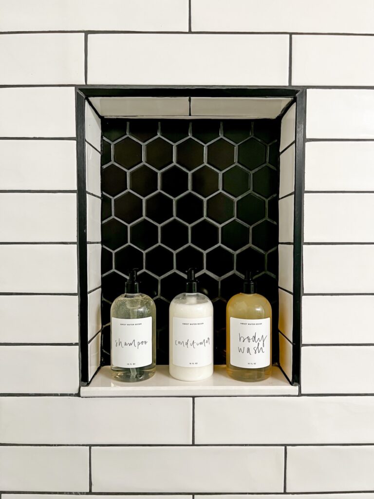
Lastly, I carried the black, white and wood theme into my bathroom. I kept it classic with white subway tile and matte black hexagon floor tiles and fixtures. My favorite feature is the faux wood ceiling I installed. It’s tile made to look like wood, so it has some subtle texture that coloring that really warms up the space.
I’ve linked everything I possibly could in case you’re interested in anything. (You can also finds lots of my decor on my Amazon storefront here). I have already bought and am in the process of renovating a townhouse, so I won’t have much time here left, but I hope the next owner loves the work I put into this place. Hope you’ll follow along my next chapter at the townhouse!
